This year marks the 125th anniversary of Alvar Aalto’s birth. A series of events will take place to celebrate his legacy. To know the intimate side of Aalto, explore his home in Helsinki on this virtual tour.
Functional, simple, and comfortable – it’s one of the iconic homes of 20th century. Designed by Alvar and Aino Aalto and completed in 1936, this house in the Munkkiniemi district in Helsinki, Finland, exemplifies the changing standards of 20th century modern living.
As an example of early 20th century Scandinavian design and architecture, it’s difficult to find a more complete and well preserved site. The house remained a family residence until 1998 and most of the original features and objects there are intact. Now it’s maintained by the Alvar Aalto Foundation, and open to the public as a museum.
Within the development of modernist architecture and design, Alvar Aalto’s approach is known for an intuitive ability to play with spatial dynamics, light and materiality. The house also contains a studio space, where the architectural office was based until the mid-fifties. It represents the modernist ideal, where functionality has been achieved without the loss for comfort. The free design of the plan and the facade, as well as the unhidden structural elements around the house, exemplify key modernist principles, interpreted for this Nordic context.
Through experiments with bent wood Alvar Aalto created different models of chairs and tables. The home is furnished with designs, which represent a modernist sensibility influenced by natural forms and phenomena. Many of these pieces are still in production by Artek, the company founded in 1935, where Aino Aalto was an influential director.
A timeless appeal lies in the simplicity of the Aalto home. The enduring modernist aesthetic and the materials that reference nature are part of a strong cultural heritage, which still informs Finnish contemporary architecture. Elements and formal solutions of this building are reinterpreted in today’s architecture and many of Aalto’s design objects can be found in homes and public buildings all over the world.
Black Chapel is a dark cylindrical pavilion designed by artist Theaster Gates for the Serpentine Gallery in London. In dialogue with iconic sacred architecture, this year’s Summer Pavilion is the largest volume to date in this programme for exhibiting temporary architecture. It’s 10 meters high with an open oculus on top, which creates a play with passing time and weather conditions inside the space.
The oculus and the circular volume recall the Pantheon in Rome, but here as a contemporary interpretation, stripped of all ornamentation and classical references. Besides sacred historic architecture, Gates plays with ideas from industrial buildigs, such as kilns for clay-making, and also mentions the Rothko Chapel as inspiration. In the press release Gates stated that: “It is my hope that Black Chapel will achieve the honorific, interrogate the sacred and encourage the social.”
Accentuated by the circular form and the dark interior, with entry and exit points to the east and west, there is a sense of mysterious togetherness in this formal conception. A path leads through the quiet volume, making you aware of physical presence and others sharing the space in a solemn and sensuous way. The structural simplicity of the construction does not call attention to itself like some of the earlier pavilion designs. The ones by Daniel Liebeskind (2001), Toyo Ito (2002), or Oscar Niemeyer 2003) were famous for their sculptural formal experiments.
In recent years the pavilion has been more focused on materiality, and as a temporary structure, with increasing attention to sustainability in the materials used. This year the pavilion is constructed with structural timber clad in modular plywood panels, which can be easily demounted. It’s a lightweight structure – with wall thickness of just 9 mm – designed to be reinstalled elsewhere eventually. The precast concrete foundations are also designed to be removed and reused.
Chicago-based Theaster Gates worked in partnership with Adjaye Associates, the architectural studio founded by David Adjaye. Although several artists have previously collaborated in the Serpentine Summer Pavilion design, the Black Chapel is the first one credited primarily to an artist. In the same way as Olafur Eliasson (2007 pavilion with Kjetil Thorsen) and Ai Weiwei (2017 pavilion with Herzog & de Meuron) Theaster Gates is known for his crossdisciplinary artistic approach. Urban projects to reinvigorate abandoned spaces are part of his practice. He is the founder of Rebuild Foundation, a non-profit platform in Chicago for strengthening communities through arts programs.
As an architectural showcase the Summer Pavilion allows for creative experimentation, and strong personal expression, beyond the reach of traditional architecture exhibitions. The location in the very heart of London, in the crossroads of Kensington Gardens, makes it accessible to a wide range of audiences, also for unexpected chance encounters for people passing through the park. As a showcase for architectural design, the Summer Pavilion always brings a new, contemporary dynamic to the Royal Parks.
Attention to the ground works surrounding the pavilion on this historic site is always immaculate, enabled by financial support from Golden Sachs, Thermes and LUMA Foundation. Technical expertise was provided this year from Aecom, an engineering firm where the team focused on small details of the cylindrical structure and minimizing materials used. Ethical sourcing of materials was supported by Grace Farms Foundation.
It’s always fascinating to follow the different narrative forms and ideas that have been seen in the Summer Pavilion designs over the past two decades. Gates’s circular form could be seen in correspondence with Koolhaas’ (2006) and Kéré’s (2018) pavilions, as well as the rectangular simplicity of Zumthor’s (2011). The name Black Chapel is a continuation with Gates’ project for the Haus der Kunst in Munich, perhaps as an homage to the late curator Okwui Enwezor, while also reminding of David Adjaye’s previous residential projects.
Open every day until October 16th, the pavilion is a space for quiet contemplation, as well as a special venue for hosting cultural events over the summer. The black-stained timber seems to absorb sound onto its matt surface and a sense of mysticism lies inside the pavilion. The height and the cylindrical volume enhance the acoustic properties of the timber structure, which will no doubt make the pavilion a great spot for all the musical performances and events that will take place over the summer. There will be a wide range of styles, from minimalist, experimental piano music, to contemporary jazz and The Choir of London Oratory performance, to look forward to.
Seven abstract paintings by Gates are displayed inside. It’s the first time that the Summer Pavilion concept includes artworks. Although Serpentine Gallery is an institution for contemporary art, until this year, the pavilion itself has been a purely architectural commission.
Serpentine Pavilion 2022, 10 June – 16 October 2022
Two major projects for art institutions designed by Frank Gehry were completed this summer. Both initiated in 2007, but each one as different from the other as could be. The LUMA Foundation building in the South of France in Arles is signature style Gehry, a fractured facade playing with light, while the Philadelphia Museum of Art is a subtle reorganisation of a 1928 neo-classical building. Both though conceived to revive the urban context surrounding them.
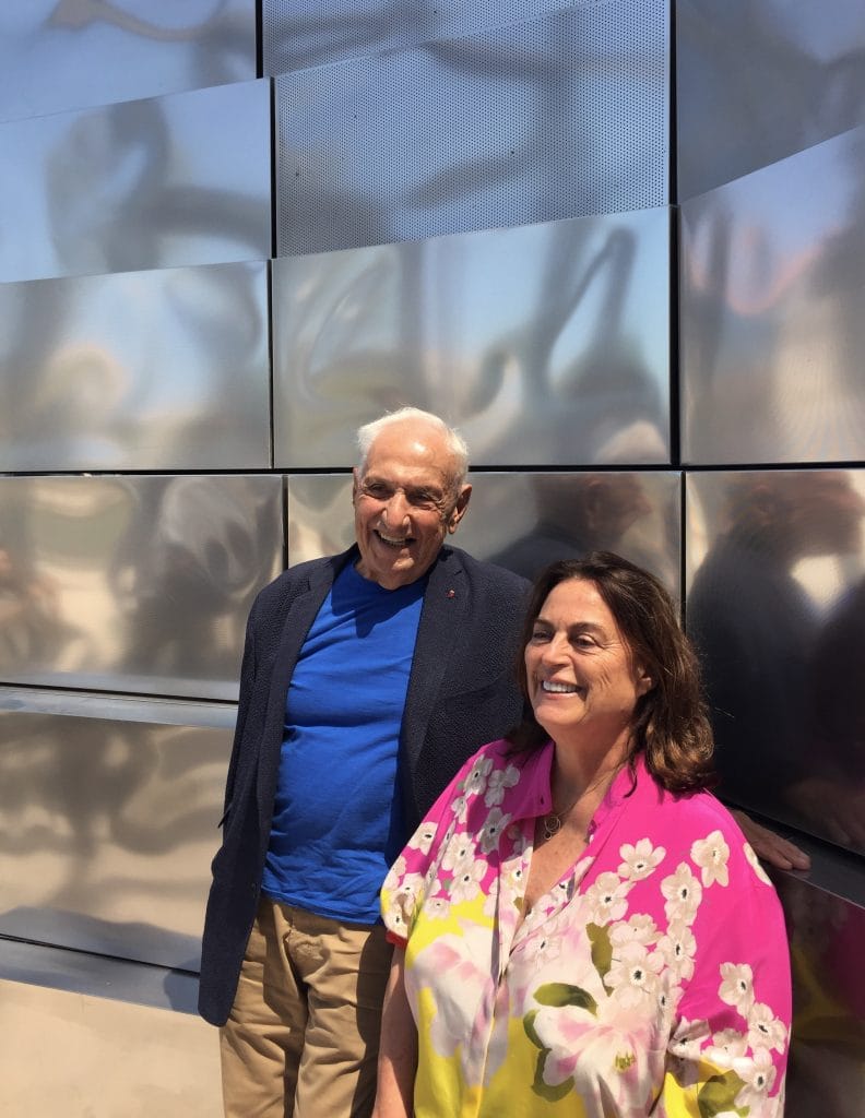
Gehry himself came to Arles for the official opening of the LUMA building. It was commissioned by Maja Hoffmann, the founder of the cultural institution, who collaborated closely on the building’s conception. As Gehry pointed out at the press conference: ”Hoffmann was not just a client, but a fantastic artist on her own.” While looking at the project as their joint project, you can see her strong influence in the architectural concept. Gehry’s highly expressive architectural language has been criticised and his flamboyant Tower as if in conflict with the historic city : too expressive, too high, why a tower, too lavish, not ecological. So when Gehry and Hoffmann entered the press conference in June, you could sense that they were prepared to defend their ambitious project.
EXPLORE VIRTUAL STORY BELOW
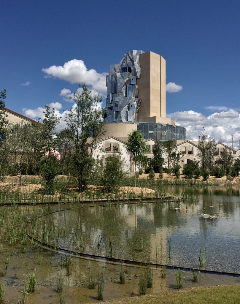
Perhaps what was most pressing for both Hoffmann and Gehry was trying to defend the architectural concept amidst claims that it was too wasteful. Indeed the façade constructed with 10,752 steel modules in total, is an elaborate construction, which does not evoke an ecological approach. To counteract this, Hoffmann has invested in transforming the former industrial yard, which had been a dead zone, into a lush state-of-the-art landscaped garden extending below Gehry’s tower. Designed by Belgian Landscape architect Bas Smets, the area is an experiment in creating a microclimate in this arid landscape, complete with a pond. Water has been diverted from the nearby canal. Smets described the challenges of growing something on plain concrete. Also it’s a historic site with archeological ruins below, so forbidden to dig too deep below.
Frank Gehry and Maja Hoffman
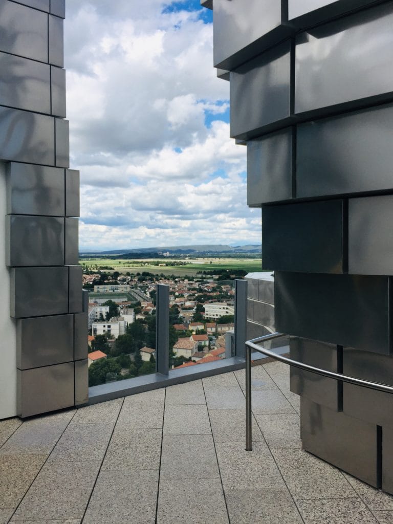
View from the rooftop terrace at LUMA, Arles
Next to Gehry’s Tower, a vast landscaped garden, designed by Bas Smets
Now Gehry’s Tower is the centre of the LUMA Foundations operations in Arles, where Hoffmann’s exceptional collection of contemporary art is stored and exhibited, alongside events, performances and research labs, dedicated to environmental design. Inside the circular glass Drum, the formal play with the fractured façade and its material logic reveals itself. Irregular units for different types of activities rise above within the Tower, souring 54 metres through the glass atrium. The metal cubes have been placed in various angles for reflecting the Provence light, creating a warm glow as Gehry had intended. In line with his inspiration of the ‘Van Gogh brush strokes’, it’s intense and expressive. It’s dreamlike – not a traditional building in any sense – it can’t be ignored and its image will not fade away easily.
As the architect who’s name is synonymous with the ’Bilbao effect’, Gehry’s architecture is famous for breaking traditional ideals about buildings. In Arles the LUMA foundation Tower no doubt exemplifies this rebellious approach, which simultaneously aims for dynamic urban renewal through architecture. At The Philadelphia Museum of Art the starting point is very different, although the goal for urban renewal is the same. Instead of deconstructing architecture that honours a glorious past, Gehry’s team reimagined how the neo-classical structure could perform in the future. The ambition to reorganise the landmark building was driven by both cultural and socio-economic goals. ”An investment in Philadelphia, not only for one of the city’s most significant cultural assets, but also for the future of the city. It is vital for our economic recovery”, Leslie Anne Miller, Chair of the museum’s Board of Trustees states in the press release. Architecture is both part of the city’s cultural offerings and a symbol for a better future.
At the Philadelphia Museum, the reorganisation of spaces has brought totally new circulation routes through the building. Parts previously used as offices have been converted into gallery spaces, and a new vertical promenade has been created, spanning the whole building on the ground floor, topped with a vaulted ceiling. In comparison to Gehry’s best known cultural buildings, such as the Guggenheim in Bilbao, Walt Disney Concert Hall in Los Angeles or Fondation Louis Vuitton in Paris, this museum has its roots firmly in history, now modernised for better energy use and improved visitor experience. Gehry’s team has adopted a different kind of play with materials, it’s more subtle, creating harmony with the idealised past.
As an emerging architect Gehry was influenced by the 1960s LA arts scene and the use of raw, industrial materials, which led to formal explorations with steel. Enabled by digital technology, these bold forms, first imagined as physical models and drawings, became actual buildings, famous for their folds and organic forms. As Gehry has explained, digital technology is a form of craft. The building process between various teams and experts, for example linking directly the stone quarry in charge of providing the material to the digital model, becomes a seamless construction process.
In the Philadelphia museum renovation, the golden-hued Kasota limestone was brought from the same place in Southern Minnesota where the material for the original building had been quarried from. This stone is used throughout the building, creating aesthetic coherence between the past and the present. In the LUMA building, this visual continuity was created with the computer, through an imprint of a local stone, then applied to concrete blocks to evoke the materiality of the near-by historic buildings.
Awarded the Pritzker Prize 2021 French architects Anne Lacaton and Jean-Philippe Vassal revive modernist principles with a unique approach –
The choice of Lacaton & Vassal as winners of the Pritzker Prize 2021 is a sign of changing values in architecture and city planning. The French duo has become famous for their unique approach in which nothing gets demolished. Their renovation project of the Grand Parc housing estate in Bordeaux exemplifies this method on a grand scale, in which 530 apartments were extended with big glassed-in balconies and new facades. It gained lots of interest and the architects received the EU Mies Award in 2019 for that project.
Lacaton & Vassal’s work is underpinned by the values of the modern movement: open-plan, lack of ornament, industrial materials and lots of daylight. With the Grand Parc renovation, they literally subvert Charles Jencks’ provocative slogan of the death of modern architecture (dated July 15, 1972, with the demolition of the Pruit-Igoe housing scheme in the US): instead of blowing up a housing block, they carefully reorganise it. After two other projects in France, where social housing has been reimagined with inventive ideas, Lacaton & Vassal show that it’s possible to find creative and sustainable solutions. Their approach has inspired architects everywhere to implement similar restorative strategies. Hopefully city planners and contractors will also realise that its possible to create something better with simple improvements.
Since their very first project, the Latapie House in France completed in 1993, Lacaton & Vassal have been experimenting with ideas and materials adopted from industrial construction. That private residence was built with a small budget, but succeeded in providing more space and daylight for less money by using cheaper materials and inventive solutions. The house is like a greenhouse transformed for dwelling, deconstructing conceptions about how houses can and should be conceived. The polycarbonate panels are inexpensive while conjuring alternative models for spatial flexibility. This aesthetic strategy, where low-cost materials can be used in poetic ways, is something the architects saw in Africa. Vassal worked in urban planning in Niger, where Lacaton went to see him before setting up their own practice in 1987 in Paris.
Their work with cultural institutions follows the same ethos. Completed in 2002, the restoration of Palais Tokyo in Paris stripped the gallery spaces inside the 1930s Palais Chaillot building of all surplus layers accumulated over the years into its bare structural bones. Rough concrete surfaces and vast open galleries provide a backdrop for contemporary arts, similar to those spaces where artists work, although on a much grander scale. The architecture school in Nantes was also imagined as an experimental building, where students would be able to work in massive unheated studios and create real scale models. In that project Lacaton & Vassal provided twice as much space for the initial budget, which first worried the school. However, it has become a new paradigm for educational spaces, in which students are active participants in its operations and social activities.
The industrial feel that underpins the architecture of Lacaton & Vassal derives from both the materials and the minimalistic structural systems. They aim for simplicity, which was one of the principles of modernist architecture: simple forms to balance complexity in contemporary life, as Vassal summarizes in the Pritzker Prize press release. In a recent d’a interview Vassal explains that they have always been fascinated by the rigorous structural systems and the minimal amount of materials that define Mies van der Rohe’ architecture. Indeed you can see this ideological link, although for a very different outcome – how Miesien office blocks can inspire social housing and how the free-flowing space of a marble pavilion can also be adopted in a low-cost approach. What is so inspirational about their work, is the reinvention and refinement of previous strategies.
This vast museum complex in the centre of Berlin has opened officially, although only virtually for the public so far. It is one the biggest cultural buildings in Europe, comparable in scale to the Louvre in Paris. With reconstructed baroque-style façades the design concept creates continuity with a glorified past of the modern era. The new museum is named after the brothers Wilhelm and Alexander von Humboldt, who brought forward a scientific and educational model influenced by the arts and philosophy of the beginning of 19th century.
The original palace on the Museum Island site had been badly damaged during World War II bombing and then demolished in 1950. It was replaced by the Palace of the Republic, built in 1976 (containing shops, restaurants and even a disco), but closed in 1990 due to problems with asbestos. Following a parliament vote in 2002, it was decided that the 1970s building would be demolished and the former palace would be rebuilt as a museum.
Italian architect Franco Stella won the architectural competition in 2008. Following the brief, three sides of the building have been constructed replicating the baroque period façades as designed by architect Andreas Schlüter (1659-1714). In Stella’s architectural concept a modern minimalist façade extends on the east side and a passageway in a north-south direction forms a covered route cutting through the middle of the building. The building combines historical forms with contemporary construction, a stylistic approach that can be linked back to the Tendenza group formed in the late 1960s in Italy, which opposed the abstraction of 20th-century modernist architecture.
In the 1970s Stella collaborated with Aldo Rossi and an influential group of architects at the Venice University, where Stella also held an academic position. Their interest towards a historical analysis of the city can be understood underpinning Franco’s winning concept for the Humboldt Forum. The reconstruction and references to history could be interpreted as a celebration of modernity and enlightenment, an epistemological break from medieval times. The architects of Tendenza blurred the hierarchies of architectural references and recognised the importance of history, which coincided with the development of postmodernism.
Stella describes the ’via colonnata’, the passageway extending across the building, as a modern reference to the long corridor at the Uffizi Gallery by Vasari. This formal strategy, which creates a public pathway through the museum, exemplifies an ideological model, where grand cultural buildings could be more closely intergrated to the urban fabric. On the Museum Island there were already five magnificent museums. The Neues Museum had also been destroyed during the war, and opened in 2009 after award-winning restoration work by David Chipperfield. A new metro station is planned to open on the island end of this year. The area is an exceptional concentration of cultural offerings.
The Humboldt Forum will be home to the Ethnological Museum, the Museum of Asian Art, as well as temporary exhibitions and the Humboldt Lab exhibition and event spaces. Both the architectural concept, where the recreation of an old palace building can be seen as a form of nostalgic idealisation of the past, and the contents of the museum, have been strongly debated. Artefacts coming from Berlin’s Ethnological Museum are part of a controversial collection, which can be traced back to the Brandenburg-Prussian Cabinet of Curiosities. Treasures brought from Africa, Asia, Oceania and the Americas belong to a contested European colonial past. Restitution to their country of origin is widely discussed. The role of the museum in this difficult issue has been brought up.
The range of historic architecture on the Museum Island is impressive. With Chipperfield’s design for the James Simon Gallery, the modern façade of Humboldt Forum appears as a pair in dialogue alongside the river Spree.
The new Berlin Brandenburg Airport (BER) designed by gmp architects is finally open. Inspired by Mies van der Rohe and preussian neo-classicism, the building conjures an idea of polished, pragmatic efficiency. For a moment of contemplation or prayer, the meditation space provides a quiet refuge in transit.
Gmp is one of the leading architectural firms for urban infrastructure with offices in Germany and Asia. They have successfully completed stadiums in China, several other airport terminals, and elaborate projects, such as the Berlin main railway station, where trains cross on two separate levels. When problems emerged at the Berlin Brandenburg terminal just before opening in 2011, the airport company took charge of the completion, which famously lasted almost a decade to finish. It’s an unusual story that award-winning architects with extensive experience lost control of completing such a major building project.
Tegel Airport (TXL) was their first big commission in the late 1960s, based on Meinhard von Gerkan’s (founding partner) idea developed as student. Von Gerkan, who has also written widely on their projects, believes in geometrical models that should guide spatial design. The TXL plan was based on a flexible concept that was initially envisioned as two identical hexagonal buildings next to each other. The new BER terminal design is also based on a geometrical model, which draws from a clearer rationalist principle. Its expansion has been imagined as continuity through rectangular forms.
Due to delays the new airport concept has been seen by some critics as outdated. Of course contantly evolving information technology and unpredictable global events change the requirements for terminal buildings. The current crisis in aviation will take 3-4 years to recover, Engelbert Lütke Daldrup, CEO of BER airport company, predicts. Hence the current size of the terminal seems perfect for the coming years. In comparison to TXL, the BER terminal is spacious with a clarity in the programme, in which the Miesien horizontal uniformity can be recognised as a guiding principle. But the unbelievably short distances, that were part of the TXL magic, are impossible today due to safety restrictions.
Besides Mies van der Rohe and Bauhaus there are formal references to the grand neo-classical buildings of Berlin and Potsdam, the architects explained. The long horizontal colonnades have been appropriated as slender columns, supporting the vast roof structure, that seems to be floating above the terminal. As a high-tech interpretation of the preussian architectural heritage, the terminal façade creates formal continuity with Berlin’s historic identity. The train connection between city centre and airport, accessed vertically below terminal 1 departure hall, has been designed to ease travel to and from airport. As the central station was also conceived by gmp, there is a formal logic binding these two major elements in the city’s infrastructure together.
Terminal architecture has become elaborate and complex, especially in Asia, where glasshouses containing gardens are incorporated into airports to soothe anxious travellers and offer environments for relaxation. At BER the terminal architecture feels pragmatic, a sophisticated and upgraded version of the generic airport environment. One of the highlights, a refuge for stressed-out travellers in need of isolation, is the Room of Silence. Unlike some airport chapels, it has been conceived as a unique part within the terminal complex, providing an abstract visual realm and a sense of stillness.
The chapel can be found on the second floor above the departure hall, behind Starbucks, and hence accessible prior to border and safety checks. In contrast to the wide-open spaces and glossy surfaces of the terminal, the chapel feels archaic and cave-like. Based on a geometric formal idea, the five interconnecting rooms have been created with a minimalist aesthetic to enhance the meditative character of the space. The aim is to serve people from all cultural and religious backgrounds as a space of reflection and prayer.
The particular haptic quality can be experienced immediately inside the entrance hall, which opens to two small courtyard rooms on both sides. Silence and tranquillity will be sensed by the body at the threshold. The walls are covered with handcrafted bricks – a materiality in total contrast to the sleek and shiny terminal spaces. Those bespoke Kolumba bricks form a layered texture to the walls, which also enhances acoustic qualities. Wall texture is emphasised by LED strips placed low at the edge of the floor, also covered with brick.
There are two prayer rooms, one with a cross and the other with a compass in bronze embedded to the floor to show the special direction for prayer. With stepped vaulted ceilings, these rooms include open horizontal joints, where light also falls from above, creating the impression of a floating ’light vault’ made of bricks. Following the geometric proportional system of the terminal, these rooms nevertheless feel separated from the mundane hassle of the world in transit surrounding them. A Zumthor-like transcendental quality reigns in these spaces.